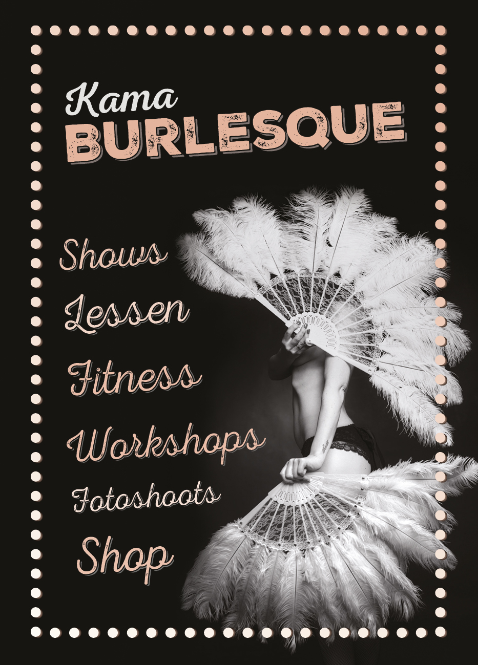
These A5-format flyers were made to promote the different aspects of Kama and offered a coupon code for the webshop on the back.
The reason the flyer uses a different font is mainly because we hadn’t found the Parisian font when the flyer was originally made. When the logo was finished, she didn’t want to change the whole flyer again, so another font is used here.
Inspiration from theater mirrors
I got the inspiration for the border from the typical theater mirrors with lightbulbs, like the ones we see in Burlesque movies. Dieuwke liked this concept and also wanted to see this effect on some of her pictures on the homepage of Kama.


No Comments